OpenZhenZhen AI 提示词画廊 · gpt-image-2.5 · image
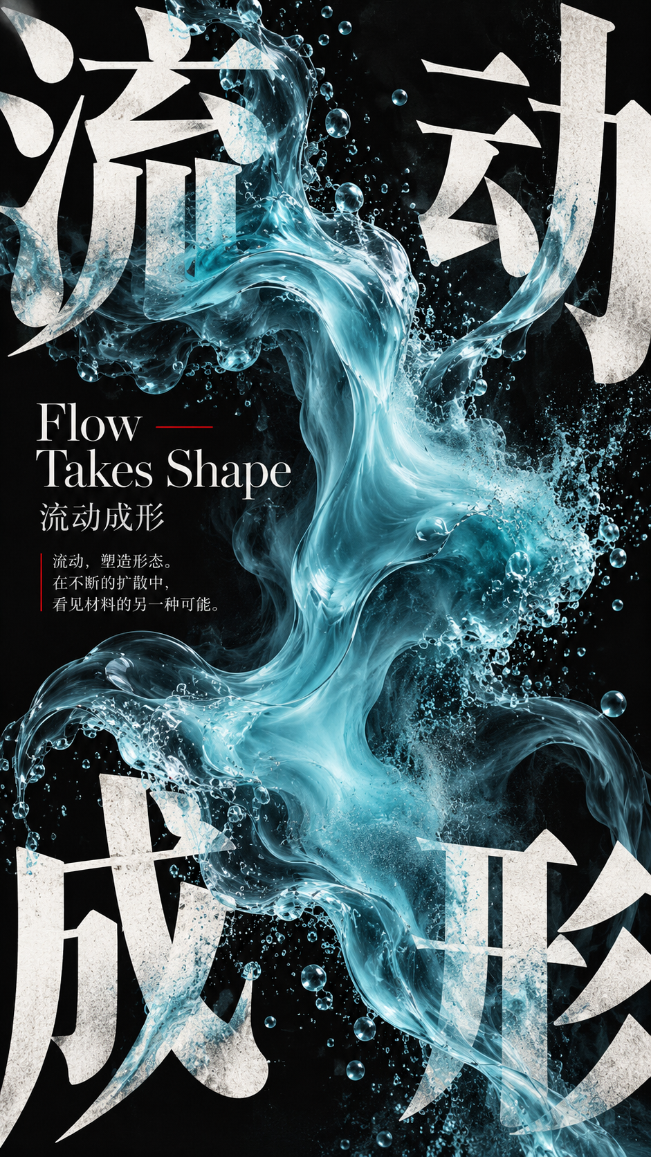
动态材质压角构图实验海报
Dynamic Material Corner Composition Experimental Poster
9:16实验性展览海报,以四角巨字和单一动态材质形成压角构图;提供完整的可替换主题、标题、材质、物理变化和配色默认值。
提示词 / Prompt
中文提示词
为“动态材质”创作一张9:16实验性竖版展览海报。将四字中文标题“流动成形”作为第一视觉图形,并以英文标题“Flow Takes Shape”作为第二层信息;四个汉字必须清晰可辨。主题、中文标题和英文标题应语义一致。 采用压角构图:把四个汉字拆开,分别从左上、右上、左下、右下向画面中心压入。通过字号、裁切、出血量和进入中心的深度制造差异;不要做成规整四宫格,也不要让四字等大。画面中央放置体量充足的半透明青蓝流体,以扩散作为唯一主导的物理变化,使材料与四角文字形成明确的对抗势能或互动。只选一种最强机制,并与所选材料相匹配;不要叠加无关特效。 材料必须遵循可信的物理逻辑:流体呈现连续浓度、卷吸和扩散;柔性膜具有真实受力点、张力、褶皱和接触阴影;熔融物体现从固态、软化到流动的连续变化;颗粒具有可信的粒径、密度、堆积和散落。只采用适合所选材料与变化的行为,让材料确实呈现运动、变形或受力响应,而不是普通3D造型。 建立三级信息层次:四角巨大的中文标题为第一层;英文标题和中文作品名为第二层;日期、地点、短句、材质关键词和简短说明仅作为第三层的少量信息。使用字号反差、不对称对齐、局部竖排中文、紧凑英文和极细分隔线。信息密度中高但集中在主体附近,同时保留干净的负空间。不得虚构活动信息。 整体控制在三至四个主要色彩层级:深墨黑作为大面积色域,暖白建立稳定的文字结构,所选材质承担主要形态与质感,朱红只用于少量短线、日期节点、受力点或编辑标记。可加入极轻的纸张纹理、丝网印刷网点、胶印颗粒和轻微套印感,但整体须现代、克制、精致。 至少形成两至三处清楚可理解的图文互动:材料可穿过大字的前后层、遮挡部分笔画、沿笔画方向延伸、在笔画附近聚集,或通过透明/半透明部分自然改变后方文字的视觉。四个核心汉字始终须可辨认。阅读顺序为:四角巨字与中央材料的大形;材料的物理变化;变化如何作用于字体和版面;最后阅读英文标题及用户提供的展览信息。缩略图中焦点明确,放大后能看到材料细节与编辑设计工艺。 避免机械四宫格、四字等大、中央主体过小、材质与字体分离、普通抽象3D团块、滥用液态金属、数字粒子、随机烟雾、RGB故障效果、赛博朋克、科技HUD、复杂参数、无意义英文、标志、二维码、编号、四角星芒和版权标记。本模板不要求人物,画面聚焦字体与材质。
English prompt
Create one experimental 9:16 vertical exhibition poster for Dynamic Materials. Use the exact four-character Chinese title “流动成形” as the primary graphic form and the English title “Flow Takes Shape” as second-level information. Keep the four Chinese characters legible. The chosen theme, title and English title must remain semantically aligned. Use corner-pressure composition: split the four Chinese characters and press them inward from the top-left, top-right, bottom-left and bottom-right. Vary character size, cropping, bleed and depth of entry; do not make a regular grid or four equal characters. Place a substantial translucent cyan fluid form in the center and show diffusion as its single dominant physical change, creating a clear visual counterforce or interaction with the corner typography. Use only one strongest physical mechanism, matched to the selected material; do not stack unrelated effects. Make the material behave credibly: fluids show continuous concentration, entrainment and diffusion; flexible films have real force points, tension, wrinkles and contact shadows; molten matter changes continuously from solid to softened to flowing; grains have believable particle size, density, accumulation and scattering. Choose only the behavior appropriate to the selected material and mechanism, so the material visibly moves, deforms or responds to force rather than reading as a generic 3D shape. Build three information levels: huge Chinese title first; English title and Chinese work name second; only supplied dates, location, short copy, material keywords or brief instructions third. Use contrasting type sizes, asymmetric alignment, occasional vertical Chinese, compact English and very thin divider lines. Keep medium-high information density in local clusters around the subject and preserve clean negative space. Do not invent event details. Limit the palette to three or four main levels: deep ink black as the broad field, warm white for stable typography, the selected material as the main shape and texture, and vermilion only for a few short rules, date nodes, force points or editorial marks. Optional paper texture, screen-print dots, offset-print grain and slight overprint must remain subtle, modern and refined. Create at least two or three understandable image-text interactions: the material may pass in front of and behind large characters, obscure selected strokes, extend along stroke direction, gather near strokes, or naturally alter text seen through transparent/translucent areas. Preserve recognition of all four Chinese characters. Reading order: bold four-corner title and central material; its physical change; the way that change affects type and layout; then the English title and any supplied exhibition information. It must read clearly as a thumbnail and reward close inspection with material detail and editorial craft. Avoid mechanical four-grids, equal-sized characters, an undersized central subject, separated material and type, generic abstract 3D blobs, excessive liquid metal, digital particles, random smoke, RGB glitch, cyberpunk, tech HUDs, complex parameters, meaningless English, logos, QR codes, numbering, four-point stars and copyright marks. No person is requested; keep the design focused on typography and material.
探索更多图片和视频提示词 · 生成图片 · 生成视频 · 在 AI 画布中创作
相关作品
- 复古日记风三张人像剪贴拼贴
将同一位约20–25岁的成年日本女性拍成三张姿势各异的随性上半身照片,重叠排成竖版剪贴拼贴,并以闪粉相框、半透明星星和可爱文具贴纸装饰。
- 酒红露肩造型东亚女性直闪人像
以3:4竖幅直闪数码摄影呈现一位成年东亚女性:三分之四侧身、轻拈发丝,穿酒红露肩短上衣与白色波点围巾,置于偏暗的虚化室内背景。
- 作品角色日系游戏吉祥物化群像设计
将指定作品的7–9位代表角色转译为统一的兔耳电子面罩吉祥物群像,以金字塔构图、作品级3–5色配色和极简竖向背景呈现。
- 桃花意境中的成年中国女性古典人像
明确成年的中国女性身着唐风汉服风格丝绸衣裙,在粉白桃花间回眸;长发、古典饰物、柔和日光和暖米色背景构成浪漫而克制的竖幅人像。
- 湖畔暖阳下的成年女性人像
成年女性身穿带完整不透明内衬的奶油白抹胸百褶长裙,站在明亮湖畔木栈道上;栗棕长发、丝巾和十字架吊坠保留了来源的清新诗意。
- 22岁韩国成年女性灰色背心裙墙边人像
明确成年的22岁韩国女性身穿不透明灰色背心裙斜靠灰蓝墙面;短波波头、轻微倾斜姿势和冷调柔光构成安静的竖版编辑人像。