OpenZhenZhen AI 提示词画廊 · gpt-image-2.5 · image
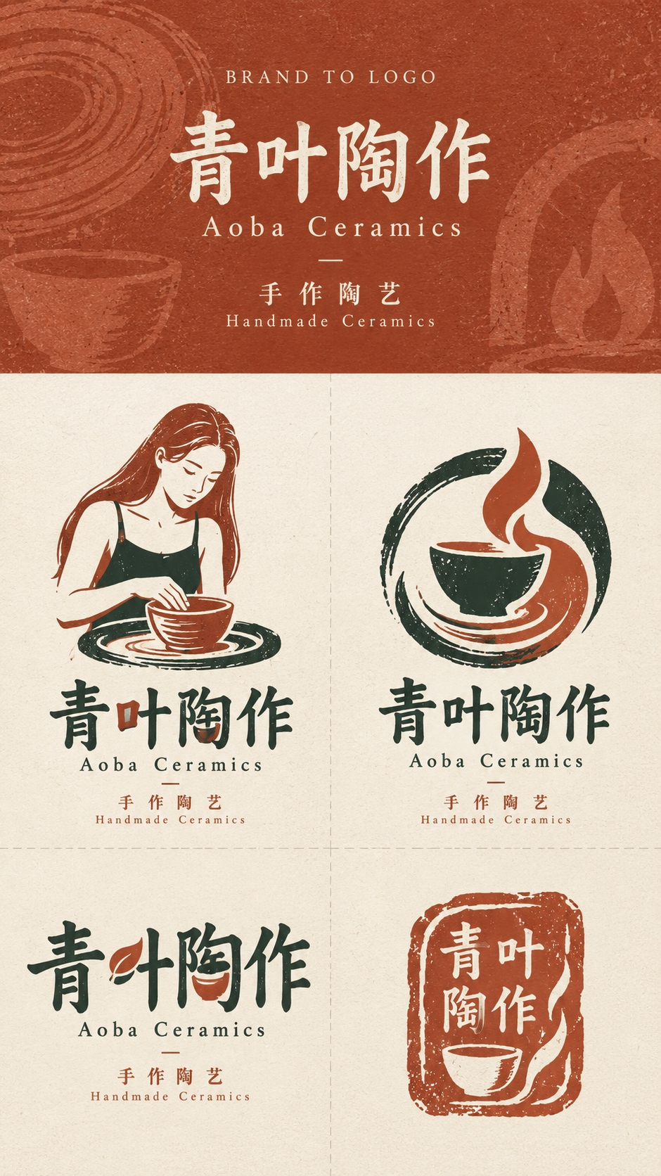
日系独立店铺品牌四方向标志探索页
Japanese Independent Shop Brand Logo Exploration: Four Directions
9:16品牌到标志探索页:顶部固定占30%,展示BRAND TO LOGO、品牌名称与描述符;下方70%以2×2等分呈现角色/图形、徽记符号、定制文字标记和情境品牌标记四个方向。使用精致日系独立店铺风格、克制配色、手工印刷纹理和充足留白;各方向方法显著不同但共享品牌世界。
提示词 / Prompt
中文提示词
为精致日系独立店铺品牌创作专业艺术指导的“BRAND TO LOGO”标志探索页,融合精品品牌设计、手工印刷图形、编辑排版、丝网/木版印刷和周到的本地商业设计。品牌输入:名称青叶陶作 / Aoba Ceramics;描述符手作陶艺 / Handmade Ceramics;业务类型陶瓷工作室 / ceramic studio;3–5个关键词手作、陶土、质朴 / handmade, clay, earthy;核心视觉理念陶轮、陶杯、窑火 / pottery wheel, ceramic cup, kiln flame;克制配色米白、陶土红、墨绿 / ivory, terracotta, deep green;页眉底色陶土红 / terracotta。默认值按中英并列原样使用,品牌名称不得改写。画布严格为9:16竖幅。顶部品牌输入区恰好占总高度30%,下方标志探索区恰好占70%;无论名称多长,分界线固定在顶部30%,长名称通过缩小字号容纳,不得增高页眉。下方70%分成等大的2×2四格,只用极细、极淡虚线分隔;不加外边框,不标A/B/C/D。顶部:以陶土红 / terracotta为主背景,加入细微纸纹、手工印刷质感和受陶轮、陶杯、窑火 / pottery wheel, ceramic cup, kiln flame启发的极低对比图形痕迹,但绝不变成完整插画。只用干净中性的字体显示BRAND TO LOGO、青叶陶作 / Aoba Ceramics和手作陶艺 / Handmade Ceramics;此输入区尚不是成品标志。不要添加标语、段落、虚构地址、日期、装饰徽章、不必要图标或过多微缩文案。左上格——角色/图形:围绕陶瓷工作室 / ceramic studio,用相关动物、产品、物件或可识别活动设计一个令人难忘的具体图形标志;只有确需人物时才可加入,并且必须是明确成年人、身份固定为ref-10a-v1。将主体简化为紧凑构图,强调强剪影、有限细节、克制色彩和细微手工印刷纹理;应像真正的品牌角色/图形标记,而非完整场景。避免动漫、夸张可爱吉祥物和素材库人物。图形须与青叶陶作 / Aoba Ceramics自然结合。右上格——徽记/符号:从陶轮、陶杯、窑火 / pottery wheel, ceramic cup, kiln flame中组合两到三个概念,通过负空间、共用几何、重叠、变形、隐喻或双关融合成一个统一符号,不要并排摆放独立图标。保持简洁,小尺寸仍清晰可读。左下格——定制文字标记:将青叶陶作 / Aoba Ceramics本身作为主标志,不要在普通字体旁另放通用图标。只改造少数真正与概念相关的字母,可使用切口、共用笔画、字腔变化、延伸曲线、负空间或结构替换,同时确保名称高度可读。右下格——情境品牌标记:为陶瓷工作室 / ceramic studio设计克制的次级标记,例如制作者标记、工坊标签、工作室标签、商店印章、服务/包装标记、镜面标签或票券。结构保持开放、实用且有充足负空间,仅在有意图处加入细微不规则。四格必须恰好各对应一种不同方法——图形、徽记、定制文字、情境标记;尺寸相等,区分清晰。每个标志仅使用从米白、陶土红、墨绿 / ivory, terracotta, deep green选择的1–3种颜色。四案共享一致的品牌世界与印刷气质,但设计方法必须明显不同。至少一个方案必须是清晰的图形/角色图像;不能四个都做成抽象、纯排版或字母组合。优先考虑强剪影、有意义的视觉关系、定制字体、负空间、克制配色、充足呼吸空间、细微印刷颗粒、受控的不规则和真实小店气质。避免通用叶片、随机植物装饰、奢侈衬线体陈词滥调、虚构创立年份、无意义字母组合、素材矢量图标、光泽效果、渐变、金属箔、铬、3D渲染、写实样机、店面场景、包装样机及无关装饰。除指定顶部输入与必要品牌标记外不要增加文字;不要水印或UI。最终页面应像独立品牌工作室的精致探索稿,为同一家店展示四种真正不同但彼此相关的方向。
English prompt
Create a professionally art-directed BRAND TO LOGO exploration sheet for a refined Japanese independent-shop identity, boutique branding, handcrafted print graphics, editorial typography, screen/block printing and thoughtful local-business design. Brand inputs: name 青叶陶作 / Aoba Ceramics; descriptor 手作陶艺 / Handmade Ceramics; business type 陶瓷工作室 / ceramic studio; 3–5 keywords 手作、陶土、质朴 / handmade, clay, earthy; core visual ideas 陶轮、陶杯、窑火 / pottery wheel, ceramic cup, kiln flame; restrained palette 米白、陶土红、墨绿 / ivory, terracotta, deep green; header background 陶土红 / terracotta. Use the bilingual defaults as supplied and preserve the brand name exactly. Strictly use a 9:16 vertical canvas. The upper brand-input section occupies exactly 30% of total height, and the lower logo-exploration section exactly 70%; keep the divider fixed at 30% even for long names, reducing type size instead of increasing header height. Divide the lower 70% into four equal cells in a 2×2 grid with only very subtle thin dashed separators; use no outer border and no A/B/C/D numbering. TOP: use 陶土红 / terracotta as the main background with subtle paper grain, handmade print texture and extremely low-contrast traces inspired by 陶轮、陶杯、窑火 / pottery wheel, ceramic cup, kiln flame, never a full illustration. Display only BRAND TO LOGO, 青叶陶作 / Aoba Ceramics and 手作陶艺 / Handmade Ceramics in clean neutral typography; do not make this input area a finished logo. Add no slogans, paragraphs, fake addresses, dates, decorative badges, unnecessary icons or excess microcopy. TOP LEFT — CHARACTER / PICTORIAL: make one memorable concrete pictorial mark directly related to 陶瓷工作室 / ceramic studio using a relevant animal, product, object or recognizable activity; a human may be used only if clearly adult and identity fixed to ref-10a-v1. Simplify it to a compact composition with strong silhouette, limited detail, restrained colors and subtle handmade print texture. Make it a genuine brand character/mark, not a full scene; avoid anime, exaggerated cute mascots and stock characters. Integrate the image naturally with 青叶陶作 / Aoba Ceramics. TOP RIGHT — EMBLEM / SYMBOL: combine two or three ideas from 陶轮、陶杯、窑火 / pottery wheel, ceramic cup, kiln flame into one unified symbol using negative space, shared geometry, overlap, transformation, metaphor or double meaning, not separate adjacent icons. Keep it simple and legible at small sizes. BOTTOM LEFT — CUSTOM WORDMARK: make 青叶陶作 / Aoba Ceramics itself the primary mark; do not pair ordinary type with a generic standalone icon. Modify only a few concept-relevant letters through cuts, shared strokes, counters, curves, negative space or structural substitutions while keeping the name highly readable. BOTTOM RIGHT — CONTEXTUAL BRAND MARK: create a restrained secondary mark suited to 陶瓷工作室 / ceramic studio, such as a maker's mark, workshop tag, studio label, shop stamp, service/packaging mark, mirror label or ticket. Keep it open and usable with generous negative space and only intentional subtle irregularity. The four cells must correspond to four distinct methods—pictorial, emblem, custom wordmark and contextual mark—each shown once, with equal size and clear visual separation. Use only 1–3 colors per logo selected from 米白、陶土红、墨绿 / ivory, terracotta, deep green. Share one coherent brand world and print character, but make the design methodologies visibly different. At least one concept must be a clear pictorial/character image; do not make all four abstract, typographic or monogram-based. Prioritize strong silhouettes, meaningful relations, custom typography, negative space, restrained color, breathing room, subtle print grain, controlled irregularity and authentic small-business character. Avoid generic leaves, random botanical decoration, luxury-serif clichés, fake founding dates, meaningless monograms, stock-vector icons, glossy effects, gradients, metallic foil, chrome, 3D rendering, photorealistic mockups, storefront scenes, packaging mockups and unrelated decoration. No extra text outside the specified top inputs and essential brand marks; no watermark or UI. The page should feel like a sophisticated independent branding studio's exploration of four genuinely different but related directions for the same shop.
探索更多图片和视频提示词 · 生成图片 · 生成视频 · 在 AI 画布中创作
相关作品
- 纪实黑白街拍:人群中的静止女性
高角度竖幅黑白纪实街拍:一位成年女性以固定角色参考保持身份一致,静立于五位运动模糊的行人之间;浅色鹅卵石街道、柔和阴天光、胶片颗粒与环绕式动势共同营造安静而有力量的瞬间。
- 手绘水彩极简旅行社论海报模板
仅凭书面目的地创作4:5竖幅旅行社论海报。自动选取与地点准确相关的地标、建筑、景观、交通、植被和文化细节,融合成单一日常场景。暖奶油色纹理纸上的透明水彩与柔水粉、柔和低饱和调色、大量留白和宁静怀旧氛围构成手工艺术书质感;底部使用三行克制的目的地文字。
- 万圣节派对成年女王角色Cosplay人像
一位成年女性在万圣节派对上以女王角色Cosplay造型亮相,拍摄为9:16竖幅人像。服装醒目且完整着衣,使用适度节庆妆造与派对环境呈现角色扮演氛围;不指定来源未提供的具体作品角色或服装细节。
- 无人体隐形人台效果的完整服饰三视图参考板
根据用户上传的服饰参考图或文字/表格设计完整穿搭的商业服饰参考图。每套穿搭在横向16:9白或浅灰无缝背景上,以左正面、中间严格90度侧面、右背面三视图呈现。仅服饰呈自然穿着的立体体积,绝不出现人体、人台、支撑物或平铺衣物;三视图保持服装、比例和配饰一致且完整。
- 迪拜与威尼斯的手绘水彩旅行艺术海报
仅凭目的地文字生成一张4:5竖幅旅行艺术海报,将迪拜与威尼斯融合为单一连贯场景:中央运河与黑色贡多拉引向历史建筑,远处哈利法塔与迪拜天际线升起,阿拉伯集市的灯笼、纺织品和棕榈树与威尼斯桥梁、阳台及水面自然交融。暖奶油色纹理纸上的透明水彩与柔和水粉、低饱和自然色、大量留白和怀旧手工艺书气质;底部仅有三行指定编辑文字。
- 日本住宅区秋日随拍:成年女性与日常白色穿搭
10月温暖晴朗的上午,日本普通住宅区的一张4:5智能手机生活照。29岁的虚构日本成年女性被朋友在散步途中随手拍下:她刚被叫住,自然停下并微微转身,穿宽松白色T恤和白色低腰短裤,手提有使用痕迹的小布包。及肩深棕发被微风吹乱,日光从住宅间斜照,背景街道与日常物件保持清晰;整体亲切、不做作,不像广告或摆拍。