OpenZhenZhen AI 提示词画廊 · gpt-image-2.5 · image
光与形之间·三段式编辑海报
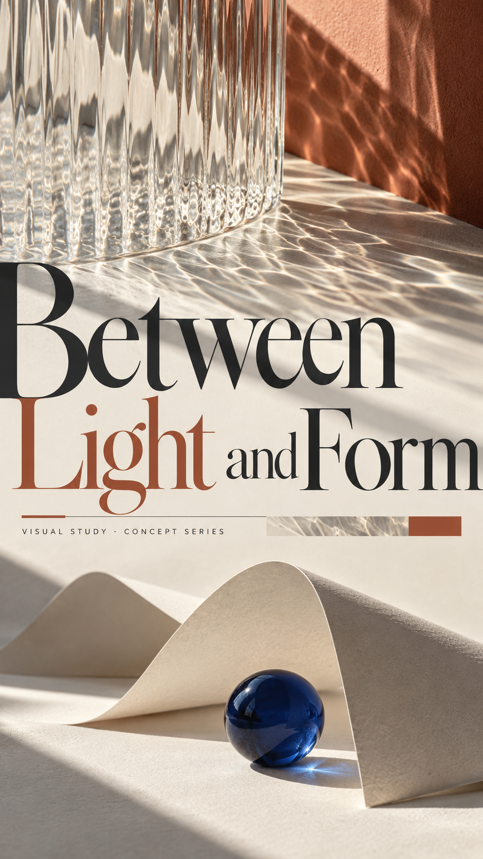
Between Light and Form: Triptych Editorial Poster
A reusable 9:16 contemporary editorial-poster recipe, demonstrated with a clearly labeled conceptual abstract-photography theme and a continuous top-middle-bottom composition.
提示词 / Prompt
中文提示词
使用以下可替换内容默认值,创作一张精致的9:16竖版现代编辑概念海报。主题:光、形与静谧几何。主标题:光与形之间。顶部区域:波纹半透明玻璃的抽象近景,表面横过一道清晰日影。中间区域:放大的裁切标题与窄幅概念信息带,衔接上下图像。底部区域:象牙白折纸与一枚小型钴蓝玻璃球构成的安静静物。配色:暖纸白、炭灰、柔和陶土色与少量钴蓝点缀。视觉风格:现代编辑摄影质感,干净印刷纹理与克制的展览海报字体。元信息:视觉研究 · 概念系列。本示例是设计概念,不是真实展览或活动公告。 构建清晰的顶部、中间、底部三段式构图,同时让整张海报像一幅连续的设计,而不是三个上下堆叠的矩形卡片。每个区域都有明确且不同的视觉职责。通过尺度、图像密度、字体大小与留白的有意差异建立层级。 顶部——第一视觉锚点:将波纹半透明玻璃的抽象近景,表面横过一道清晰日影表现为开场图像或主体。中间——结构衔接点:将放大的裁切标题与窄幅概念信息带,衔接上下图像作为上下区域的连接,可根据需要使用简洁标题、窄幅信息带、图像条或字体过渡。底部——空间收束:将象牙白折纸与一枚小型钴蓝玻璃球构成的安静静物表现为第二视觉重心或安静的结束点。全程保持给定配色暖纸白、炭灰、柔和陶土色与少量钴蓝点缀和视觉风格现代编辑摄影质感,干净印刷纹理与克制的展览海报字体的一致性。 避免僵硬卡片边界。通过遮罩、重叠、不规则轮廓、透明度、氛围过渡或前后景关系,让少量元素跨越区域交界。字体必须参与设计:可在页边裁切大型字形、让其局部藏于图像之后,或与留白互动,同时保证主标题可读。 保持编辑设计层级:一个主导标题、一层清晰的次级信息,以及少量有意义的元信息。主标题准确使用光与形之间,元信息准确使用视觉研究 · 概念系列;这些是概念文案默认值,不代表真实场地或日期。小字应像真正的编辑信息,而非装饰填充。保留有意安排的安静区域,不要填满所有空白。 安排三层阅读顺序:第一眼立即看清总体结构;第二眼发现字体与图像的互动;第三眼读到较小信息和印刷细节。采用克制的信息密度、有目的的裁切、干净的印刷纹理和专业编辑间距。只呈现指定的标题、次级信息和元信息;不要编造额外活动事实、日期、场地、标志或水印。 最终效果:一张完成度高的9:16现代编辑概念海报,顶部、中间和底部各有清晰职责又彼此穿插,字体与图像互动明确,留白有节奏,整体统一并具有适合印刷的质感。
English prompt
Create a refined contemporary 9:16 vertical editorial concept poster using these replaceable content defaults. Theme: Light, Form and Quiet Geometry. Main title: Between Light and Form. Top section: a close abstract photograph of rippled translucent glass crossed by a crisp sunlit shadow. Middle section: an oversized cropped title and a narrow concept-information band linking the imagery. Bottom section: a quiet still life of folded ivory paper and one small cobalt-blue glass sphere. Palette: warm paper white, charcoal, muted terracotta and a small cobalt accent. Visual style: contemporary editorial photography with clean print texture and restrained museum-poster typography. Metadata: VISUAL STUDY · CONCEPT SERIES. The example is a design concept, not an announcement of a real exhibition or event. Build a clear three-part composition—top, middle and bottom—while making the whole page feel like one continuous designed image, never three stacked rectangular cards. Give each region a distinct role. Use deliberate differences in scale, image density, type size and negative space to establish hierarchy. TOP — first visual anchor: realize a close abstract photograph of rippled translucent glass crossed by a crisp sunlit shadow as the opening image or subject. MIDDLE — structural hinge: realize an oversized cropped title and a narrow concept-information band linking the imagery as the connector between upper and lower areas, using a concise title, narrow information band, image strip or typographic transition as appropriate. BOTTOM — spatial conclusion: realize a quiet still life of folded ivory paper and one small cobalt-blue glass sphere as the second visual weight or quiet endpoint. Preserve the supplied palette warm paper white, charcoal, muted terracotta and a small cobalt accent and style contemporary editorial photography with clean print texture and restrained museum-poster typography throughout. Avoid rigid card boundaries. Let a few selected forms cross regional boundaries through masking, overlap, irregular silhouettes, transparency, atmospheric transitions or foreground/background relationships. Typography must participate in the design: crop a large letterform at the page edge, partially tuck it behind an image, or let it interact with negative space, while keeping the main title readable. Maintain an editorial hierarchy of one dominant title, one clear secondary information layer, and small meaningful metadata. Set the title exactly as Between Light and Form and the metadata exactly as VISUAL STUDY · CONCEPT SERIES; these are concept-copy defaults, not real venue/date claims. Small type must read as genuine editorial information, not decorative filler. Keep some areas intentionally quiet and do not fill every empty space. Design the reading sequence so the first glance reveals the main structure, the second reveals the interaction of typography and imagery, and the third reveals the smaller information and print details. Use controlled information density, deliberate cropping, clean print texture and professional editorial spacing. Render only the specified title, secondary information and metadata; do not invent additional event facts, dates, venues, logos or watermarks. FINAL RESULT: one polished 9:16 contemporary editorial concept poster with distinct but interwoven top, middle and bottom roles, confident typographic-image interaction, intentional negative space and a cohesive print-ready finish.
探索更多图片和视频提示词 · 生成图片 · 生成视频 · 在 AI 画布中创作
相关作品
- 原图与手工纸艺插画上下双联海报
竖版3:4画册风双联海报:上半保留用户上传图像,下半以同场景手工纸艺风格重绘;不添加未提供文字。
- 白素贞Y2K千禧街头时尚海报
3:4竖版时尚杂志风格海报,以{{character_name}}为主题,将Y2K千禧街头与嘻哈造型、强烈撞色和高饱和纯色背景结合,形成电影感高对比时尚摄影。
- 冰蓝浮雕笔触中的雪景人像
2:3竖版幻想人像与厚涂浮雕融合:25岁成年东亚女性侧坐于冰蓝与象牙白颜料形成的立体台沿,俯看掌中雪花;腰侧嵌有小巧冬日微缩景观。
- 照片主角登上皮影暖幕
3:4竖版上下均分海报:上半保留单张来源照片主体和自然质感;下半将同一主角转译为暖光宣纸幕上的镂刻皮影,中央一幕、充足留白,并可排一条短戏名。
- 蓝白星空浮雕中的全身人像
竖版全身艺术人像:28岁成年女性侧坐在墙面外凸的立体座台上,白色刺绣雪纺裙与蓝白油画星空、云浪和微缩建筑形成层次。
- 竹影茶院中的新中式人像
2:3竖版正面半身旅行写真,25岁左右成年东亚女性身穿浅紫蓝真丝提花上衣与米白长裙,立于传统茶院木门旁;侧前方自然日光映出竹影与细致刺绣。